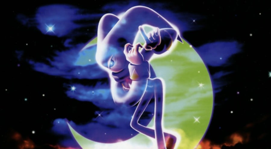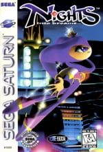
The Saturn never got a full-blown Sonic outing, but it did get the excellent NiGHTS into Dreams, a 3D adventure from Sonic Team that still has plenty of fans, despite not getting a new mainline entry since 2007's NiGHTS: Journey of Dreams on Wii.
If you're like me and have to type out words for a living, you may have pondered why the logo for the game has that odd capitalisation.
Kazuyuki Hoshino, who worked as an artist on the 1996 release, has taken to social media to explain:
"In my logo, only the “i” is lowercase. It represents a tiny “love” (pronounced [aɪ] in Japanese) just starting to bloom between Elliot and Claris — a small love story."
NiGHTS was a significant release for Saturn, as it was the first game to utilise the new 3D Pad, which offered analogue control via a Hall Effect stick – a technology that, decades later, has been adopted across many modern controllers.
Hoshino joined Sonic Team in 1993 and has been with the studio ever since. He's currently employed as Creative Director, and is credited with designing Metal Sonic, Amy Rose, and Shadow the Hedgehog.
Outside of being deeply involved with the mainline Sonic series, his other credits include Burning Rangers (internet support), Mario & Sonic at the Sochi 2014 Olympic Winter Games (senior art director), Puyo Puyo Tetris (project support) and Panic! (graphic design).

