
When you think of the most recognizable logos in gaming, EA Sports is pretty high on the list. The iconic logo has appeared across some of the most commercially successful sports series of all time, from FIFA to Madden, and is often accompanied by Andrew Anthony's memorable voiceover: "EA Sports - It's in the game". However, as we recently learned, the journey to building one of the most influential brands in gaming was anything but straightforward, with the company having to deal with internal doubts about the project as well as legal threats from the American sports network ESPN.
Over the last couple of months, we've spoken to Don Transeth, the former vice president of sports marketing and brand innovation at EA, and the (now retired) San Francisco designer Michael Osborne, both of whom were involved in the creation of the EA Sports logo. They were able to tell us more about the various twists and turns that led us to the current logo that we recognize today and gave us their thoughts on why the brand still resonates all these years later. To tell this story, though, we first have to set the scene.
Building A TV-Style Brand
Before EA Sports was even a thing, Electronic Arts had already released a collection of original sports games, including successful titles like Skate or Die!, John Madden Football, and Earl Weaver Baseball, to name but a few. The approach at the time, however, was to silo these games away from one another, rather than build an overarching brand identity that fans could easily recognize and identify with. Because of this, a group of individuals inside EA, including the producer Don Traeger, designer Michael Kosaka, and the marketing and advertising person Don Transeth discussed the idea one day in early 1991 of bringing its sports content together under a single umbrella brand modelled after the American sports network ESPN.
Transeth tells us, "The idea was to create a TV-style presentation for all the games, and the biggest sports network is ESPN. It just dominates. It’s like Sky Sports on steroids. So coming out of that initial brainstorming session with Don and Michael, then it became a question of thinking of the next steps."
"We needed a positioning," he continues. "A vision for the brand. And what I had written in that initial document as the positioning was, ‘We’ll be making real sports games for real sports fans.’ So it was all about authenticity and that was sort of the 'true north' of the brand as it evolved: to be the most accurate simulation of the sports. Not the arcade style with the basketball on flames and so forth."
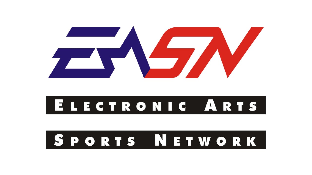
The team at EA called this brand the EA Sports Network (or EASN for short) and for the logo, Transeth reached out to the husband of one of his wife's friends, Michael Osborne, who was already an established San Francisco designer.
"We had kids about the same age," says Transeth. "So, we went to the park and talked and I found out he was a designer. At the time, he was a very high-profile designer in San Francisco. One of the top-tier guys. And EA was basically a start-up. But I found out that Michael was a sports fan and we loved the same baseball team, the San Francisco Giants, so I talked to him about creating a logo, and we bundled three projects into one assignment for him. He did a logo, and a poster for EASN, and I think we gave him a package at the time. So we scooped up all our money and put it into a pot and said, ‘Here!’"
Osborne gives his perspective, "Our kids went to school together. Our wives got to know each other. And of course, we met and we had that in common. We became friends and this project came up, so Don called me and asked if I wanted to get involved. Of course, there was no such thing as EA Sports. I had never heard of anything like that before, so at the time it seemed like just another project."
...the conventional wisdom was that it would never work. The producers were having a hard time visualising the value...
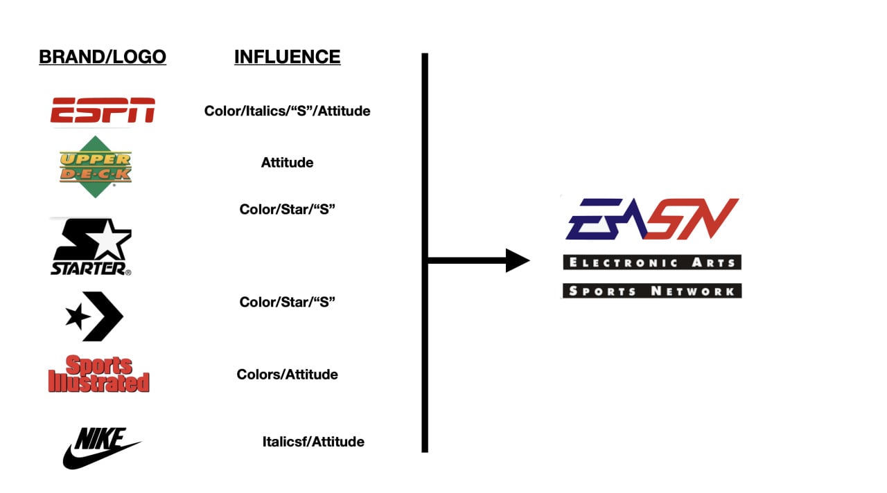
Osborne tells us he hand-drew the initial designs for the 'EASN' logo. And that, after some back and forth, what he ended up with was a sans-serif italic font, with a star incorporated into the letter form and two black bars situated below. Besides ESPN, the inspirations for the logo were the sports clothing range Starter, popular shoe companies like Nike and Converse, and the magazine publication Sports Illustrated. Transeth, meanwhile, picked the colours based on an analysis of the most popular ones American sports teams were using at the time — red, white, and blue — with the goal not being to stand out but to try and blend in with the rest of the sports landscape.
As the EASN logo began taking shape, Transeth still had another hill to climb. Namely, trying to convince the companies' various production teams to get on board with this new sporting brand. Some were initially resistant to the change, questioning why they should give up valuable memory and packaging space for this new logo.
As Transeth says, "They really didn’t get the idea for the brand. Nobody had created a brand of games at that point. There were the hardware brands. There were the Nintendos and the Segas and the Commodores and the Ataris, but nobody was making a proper gaming brand. So the conventional wisdom was that it would never work. The producers were having a hard time visualizing the value, so we took it upon ourselves to create this logo, because I felt that if they could actually visualize what it would look like and feel like, then they would understand how it would be supportive of their efforts."
In order to convince the teams at EA, Transeth made a large 3D version of the logo out of surfboard foam and put the logo on the back of some high-end jackets, similar to the type "TV producers might wear on the sidelines". He hoped this would communicate the idea behind the brand and that the promise of some swag might turn a few heads.
Transeth recalls, "We basically had to bribe the producers. They were saying, ‘Those jackets are fucking cool.’ And we were like, ‘You can't get the swag until you put our brand in your game.’ So, they were like, ‘Alright!’ So we basically had to bribe our way into doing this by buying cool T-shirts and hats and jackets, but that seemed to do the trick."
Switching To EA Sports
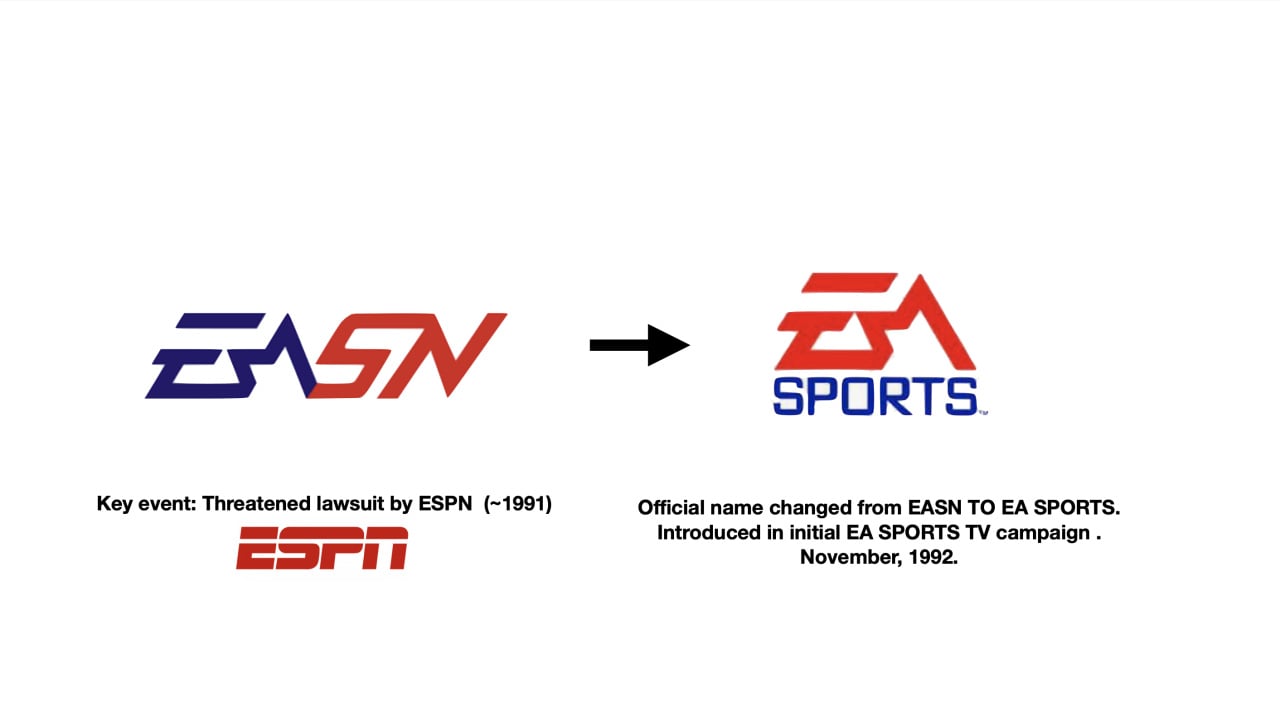
Besides reluctant producers, EA ran into some other issues too, with the launch of the EA Sports Network. The most significant of these was a legal threat from ESPN who had started to see the 'EASN' logo on the packaging of various EA games. Sometime in mid-1991, ESPN's Jim Noel called the EA offices and expressed concerns over the new video game brand. According to Transeth, Noel was worried the brands were "too close" and wanted to see if ESPN could arrange an agreement with EA to change the logo.

"My boss at the time panicked," says Transeth. "He came running in and said, ‘ESPN has called, they have an issue with our name and logo, how much is the brand worth today?’ We'd run two or three ads at probably $5000 a piece at this point, and we’d put a couple of logos on the packages. So, I said to my boss, ‘Jack, it’s a million-dollar brand.’ I completely made that up, but he said he could work with that and left."
Weeks later, his boss returned, announcing some bittersweet news. EA needed to change its sports logo, but it would receive $1,000,000 in television time on ESPN as compensation. EA had never advertised on television before, but now it was going to appear on ESPN, one of the largest sports networks in the country. Somehow events had worked out in its favour. The only issue was what they were going to do for a new logo.
The following year, in 1992, EA hired a young San Francisco advertising agency called OWN&P to help come up with a new name and logo for the brand, and it was during the initial meetings that one of its creative directors Michael Wilde came up with an obvious, yet brilliant, solution to the problem.
Transeth recalls, "We went into a conference room with the two creative directors from the advertising agency. And we were talking about options. Michael Wilde, who didn’t talk much, and when he got nervous he kind of stuttered, finally said, ‘Well shit, let’s cut the fucker off right there, keep the EA, drop down the sports, bob’s yer uncle.’ And we were like, ‘Actually, that’s a much better name. Done.’"
To create the new logo, EA retained the letter forms that Osborne had originally designed, with Wilde art directing a new pass. At the same time, OWN&P also worked on the television campaign, with the agency suggesting the phrase "If it's in the game, it's in the game" based on Transeth's initial brief regarding authenticity. At first, Transeth tells us he wasn't exactly blown away.
"Jeff Odiorne, our writer, said, ‘That’s our campaign line, that’s our tagline'," says Transeth. "I thought but that's so simple. So, we agreed that we would do it for the initial campaign and we would monitor the results, and if the results were good, we’d keep it, and if it didn’t resonate we would move onto something else."
In the final television campaign, Odiorne added a closing line to go with the final logo, "EA Sports — it's in the game", and recruited the unknown Andrew Anthony to voice the advert. Reflecting on it today, Transeth recognizes just how important those decisions were.
"The voice I think was an absolutely vital component to communicating the brand," says Transeth. "The brand was unique as a visual and it did its job, but when you had the overlay of the audio component hammering it home, that combination was special."
The new EA Sports logo debuted, along with the brand on ESPN, in November 1992 and was a huge success in generating interest. Remarkably, it still exists even to this day, though the logo has undergone some small cosmetic changes in the intervening years
For instance, in the year 2000, Nancy Fong, the vice president of creative services, directed a project that saw EA drop the star from the EA Sports logo and add a small silver circular bezel in order to make it easier to include in marketing materials. Obsorne's letter fonts were also adopted around the same time as the corporate logo, though he wasn't involved in this decision.
For multiple generations, the EA Sports logo has become inextricably linked with childhood memories of playing titles FIFA, Madden, and NBA Live. So we asked Osborne and Transeth their thoughts on why it still has such an impact on gamers.
Osborne surmises, "The EA Sports brand was a perfect storm where they had John Madden and they had a great line of sports games when that technology was young. They also had the voiceover. They had the logo. They had the halo effect from their interaction with ESPN. Everything happened all at once. And it was great to watch."
Transeth says, "It wasn’t just the logo, it wasn’t just the tagline. And if we had done it with crap games, nobody would have cared. [...] We made the best sports games in the world, and for our audience at that time, for a lot of them, it was the best part of their lives growing up playing those games, seeing that logo, and hearing that voice. It just represents the best of times with the best of friends."