
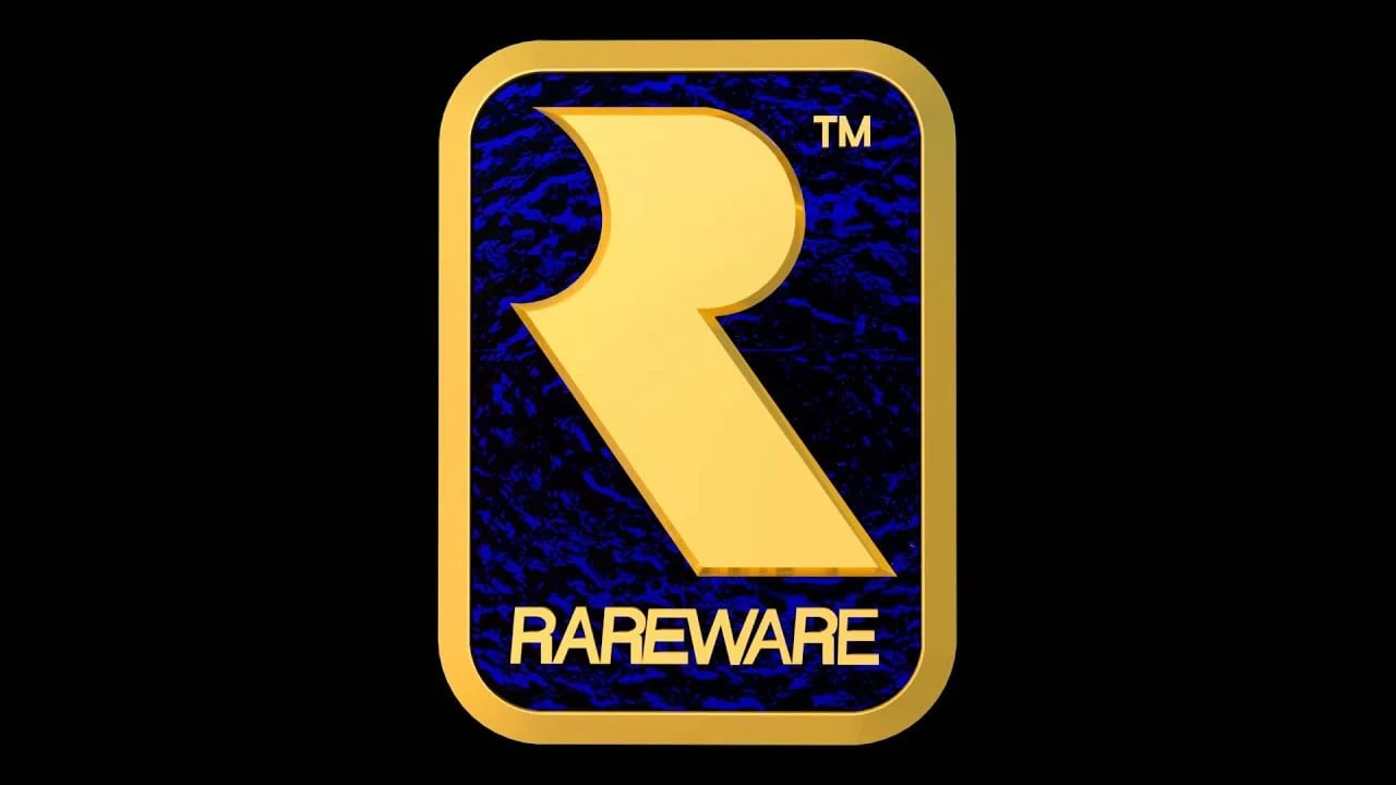
Back in the '90s, the Rare logo was a stamp of quality that adorned many of our favourite games, including Donkey Kong Country, GoldenEye 007, and Banjo Kazooie. A curved "R" set against a blue and gold backdrop, it's been affectionately referred to in the years since as a "Golden Toilet Roll" because of its uncanny resemblance to a toilet roll holder. Yet somehow thirty years later it still manages to provoke a nostalgic response, thanks, no doubt, to our childhoods spent playing classic Rare games.
In June 2019, the former Rare artist Steve Mayles revealed to the world that Kevin Bayliss was the person responsible for creating this iconic logo, so, while researching the origin of various other video game logos for a future article, we reached out to Bayliss for the story of how this famous symbol came to be. He was able to tell us more about his thought process and how he was tapped for the job, in the beginning. According to him, it all started with some good timing and an intense dislike for a "three-colour fad" he believed was taking the video game world by storm.
When Bayliss first joined the company in 1987, Rare was using a gold "Ultimate-Esque" logo of a deer jumping through the font. This soon changed, however, to another one, which the Rare co-founder Tim Stamper had designed and airbrushed, reading "Rare - Designs on the future". The new logo stuck with the company for several years, until 1994, which is when Stamper wanted the company to undergo another rebrand, to show off the ACM (Advanced Computer Modelling) technology that it was using on Donkey Kong Country.

Stamper requested a new design for a logo and tasked artist Steve Mayles with creating it. But when Bayliss first saw this design, he had concerns.
"I remember walking through the offices one day and saw what Steve was up to, and joked that it just looked like some kind of 'infant toy' because of the simplistic graphics and colours," he tells Time Extension. "Steve had created an 'R' out of what looked like 3 blobs of paint, in primary colours - similar to the 3DO logo.
"Now there was nothing 'wrong' with Steve's work, but I was concerned that the 3 colour, 3 shapes 'fad' was going to soon go out of fashion and would date our games horribly. Also, I was a little worried that the logo would just become buried within a pile of different coloured blobs for every other video game company that made the same decision to take that approach. Funnily enough, I look back now and there wasn't really that many of them anyway - but for some reason, I had a pet hate for this ‘gimmick’ and Tim noticed how passionate I was about it."
After a slight telling-off for vocally criticizing Mayles' work, Bayliss was given an opportunity to have his own shot at the logo to let him prove he could do better and immediately, he had some ideas.
"We were always rewarded with the promise of a trip to CES or whatever big show our games were launched at after development, and it was nice to have some kind of badge on our suits.
"At the time I think we'd all been sporting a small steel pin on our lapels with the 'Rare' font logo embossed within it. We always wore suits and dressed very smartly while attending the shows and so I had this in mind and wanted to create something that looked a little bit 'classy' on our formal attire. It soon became very different as we all eventually wore branded polo shirts, usually featuring the game we were promoting, but at this time I wanted to make something that worked with a shirt, tie and suit."
Rather than use the whole wording for the company, Bayliss looked at simple shapes and knew he wanted the 'R' from Rare as the main focus.
He quickly drew the curve of the letter and removed the upright stem, to create a shape that is the Rare 'R' that we see today. He then showed it to Tim Stamper, who was enthusiastic, but suggested "making something that wasn't going to slice our fingers off every time we tried to pin it onto our lapels." That's when Bayliss remembered the style of badges prefects would wear at his old school.
"Prefects wore a blue and gold rectangular enamel badge with rounded edges, which gave them the power to tell you to 'do your tie up' properly, or monitor the hallways and send you outside while it was raining as they stood around feeling important, leaning against the hallway radiators. These weren't popular kids, (I was one for a brief period at primary school) but they did have a fancy badge that made them oh-so-powerful.
"Knowing that Tim was into his classic 'Navy Blue and Gold', I decided to surround the R shape in a golden rectangle with rounded edges and give it an enamel Navy Blue background, placing the word Rareware beneath it. ‘Classy’ I thought. Creating it in Maya / PowerAnimator was very easy and I could show a really accurate representation of how it would look by rendering it up."
When he showed this updated logo to Tim Stamper, his boss loved the new design and it was quickly incorporated into the company's marketing materials, games, and event wear. At E3 1995, when Rare revealed Killer Instinct for the Super Nintendo, a thick version of the logo was embroidered onto the side of a polo shirt the team were wearing. They joked at the time that this was to protect them from "angry Capcom or Williams engineers who could see how great KI looked!"
The Rare logo went on to become a beloved symbol in gaming and still informs the company's current logo today. However, as Bayliss would discover, there may have been another subconscious influence on its design, other than prefect badges and other "classy" ideas.
"I remember a year or so after designing it, I pulled up on a garage forecourt one day to fill up my car," he tells us. "I noticed the symbols that were on the side of the petrol pumps near to the paper towel dispensers that are often seen outside, and there it was: ‘The R logo’. It was also a simplistic 'icon' for towel dispensers and I couldn't get it out of my head after that. I knew I'd seen it somewhere before subconsciously. Then a few months later, I was in an aeroplane toilet and saw the same logo. I'll let you use your imagination from here on out.
"Along with Diddy, Ki, the Battletoads, and the re-design of Donkey Kong, I think the Rare logo is possibly the one part of my legacy I’ll leave ‘behind’ that I wish I’d perhaps thought out a little more before angrily creating what became known as ‘The Golden Toilet Roll’ among myself and Rare colleagues back in the day."