Tim Girvin isn't a name that we're betting most Nintendo fans will be aware of, but we're almost 100% sure that you would have encountered his work in the past if you happen to have a passing interest in retro gaming.
A "strategic branding expert" and designer by trade, Girvin played a large and incredibly important role in establishing the visual identity of Nintendo of America's games and consoles in the '80s and '90s, becoming the company's secret weapon in making sure its products stood out in crowded malls and store windows across the US and North America.
Over a decade as a Nintendo collaborator, he helped create the iconic design language used for the packaging of the NES and its line of products, and later went on to do the same for the Nintendo Game Boy, SNES, and Virtual Boy. In addition to this, he also contributed to a ton of artwork for Nintendo's first-party games during the 8-bit and 16-bit eras, having a major hand in designing the famous artwork of the 1989 Game Boy pack-in title Tetris, the packaging for Legend of Zelda and Super Mario Bros. 3, and the logos featured on the boxes for Final Fantasy and A Link to the Past. These are all things that he developed with his Seattle-based design firm (also named Girvin) — a company that he originally established out of his dorm while teaching workshops at the Evergreen State College in Olympia, Washington, back in 1973.
Today, Girvin is very much still a presence in the world of branding and design, typically dividing his time between helping world-famous companies make their products more appealing to customers and writing blogs that impart the wisdom he has acquired over his 50+ years in the biz. However, over the last few weeks, he agreed to take some time out of his busy schedule to let Time Extension ask him several questions about the fascinating part he played in Nintendo's past.
During this conversation, he let us in on how he originally got involved in sprucing up Nintendo's product line, gave us some insight into the story behind the packaging for the Nintendo Entertainment System and the Nintendo Game Boy, and talked about the differences between Nintendo's branding in North America and Japan. Before we go into all of that, though, it's probably for the best that we give you some more information about the man himself, including how he originally set out on a career in branding, just to set the scene a little and give you some added context about his background.
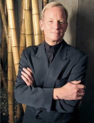
According to Girvin, growing up in Spokane, Washington, he had always been a "curious person", with his father expecting him to follow him into a career in science. Because of this, he had set out to study marine biology at the New College of Florida, in Sarasota, Florida, but soon gave up, because of his distaste for vivisection - i.e., cutting open live animals. Speaking with his college professor, it was then that he was encouraged to pursue another area of study — design — with his teacher praising the impressive drawings he had been creating alongside his laboratory notes.
Reflecting on this period of his life, he told us, "At College, we kept killing everything we were studying, so I gave up on that, took a side-bar in medieval history, with a foundational experience in calligraphy with [the American calligrapher and professor] Lloyd Reynolds. I started studying that more broadly, mostly linking paleography to culture. Then, from there, with Medieval studies, I realized that 'Wow, that’s a deep line of exploration.'"
Having noticed his passion for design and typeography was growing, as a result of his calligraphy studies, Girvin soon decided he wanted to pursue a career that would take advantage of these developing skills, so he taught calligraphy workshops at the Evergreen State College in Olympia, Washington to support his tuition (he would also attend Evergreen to study art, fine printing, and typeography), and created a set of companies in the early 70s to offer his services up to potential businesses. These companies included Girvin Strategic Branding & Design (which is still around today), as well as a separate sign-writing and hand lettering business, called Alphabetica, which he initially ran out of his 1959 Dodge pickup called Ruby.
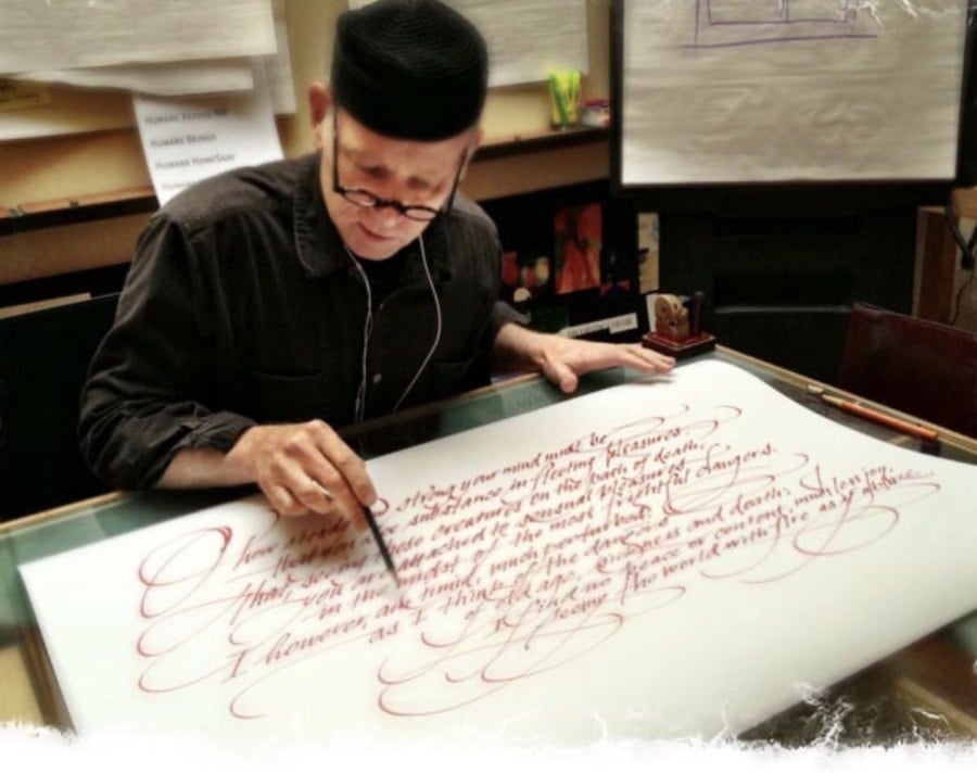
Out of these two ventures, it was Girvin Strategic Branding & Design that was undoubtedly the more successful of the two, with the company gradually becoming the go-to design firm for companies in the Washington area looking for someone skilled in branding, typeography, calligraphy, and design. This, ultimately, led the Redmond-based company, Nintendo of America, to approach him in the mid-80s to create a company Christmas card featuring their mascot, the Italian plumber Mario.
"I was asked by the then-CEO Minoru Arakawa to design a Christmas for him and Nintendo of America," Girvin told us. "It was a folding #10 card, a Christmas greeting script in a Spencerian calligraphy, with Mario dancing in the line of calligraphy—printed in two metallics. It ended up being exactly what they were looking for, and while we were talking, I ambitiously offered a pitch towards a design evolution from the initial lineup of NES packaging as a more integrative packaging expert, as their approach was still fairly undisciplined."
[The Christmas card] ended up being a success, and while we were talking, I offered a pitch towards a design evolution from the initial lineup of NES packaging as a more integrative packaging expert, as at the time it was fairly undisciplined
At the time of these discussions, Nintendo of America had already begun rolling out the NES in North America, starting with a New York test market in October 1985 and continuing with a nationwide rollout in 1986, with the different NES bundles available (including the Deluxe Set and the Control Deck) featuring a fairly basic black design, with an accompanying image of either the console or R.O.B the Robot.
As for the game packaging, it was also black, with Nintendo designing the artwork to show a small, pixelated depiction of a character from each game, which was drawn to be similar to how they would ultimately look when they appear on your TV screen. This was intended to serve as a contrast to the flashy, deceptive packaging of the Atari 2600 library, which had previously been known to feature extravagant paintings that would often translate to simple stick figures when you would actually plug in your games, according to the former Nintendo of America vice president of sales, Bruce Lowry.
Seeing this "fairly generic" approach, Girvin had wanted to take Nintendo of America's packaging in a more exciting, dynamic direction, hoping to establish a more visually striking approach to design that played more to the strengths of the console and its titles, while providing enough visual data via screenshots on the packaging for customers to feel like they could make an informed purchasing decision.
"In particular, we pushed for more energetic and customized approaches to each game," Girvin said. "So I worked towards creating a more energized and celebrative gaming attitude, like, “Wait, this is the real thing, this is where the game truly begins.”
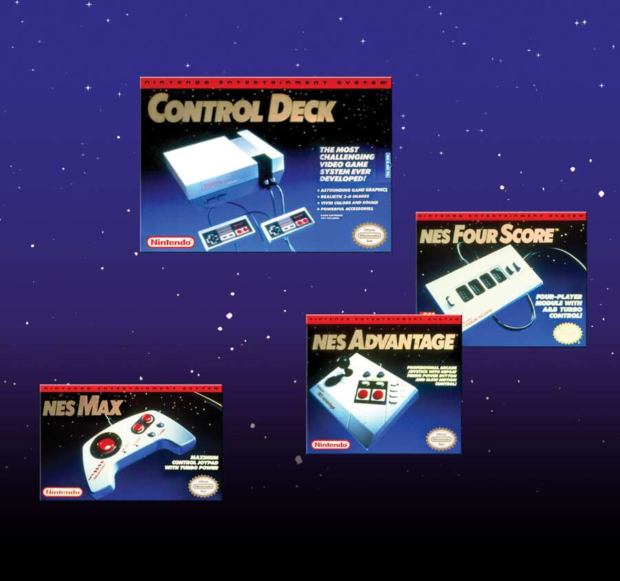
"To do that, I developed a strategy and tactical expression for a newly-disciplined overarching strategy for the NES hardware collection. This was integrative in the manner of a more systemic approach to the core NES branding/banding, as well as colour systems, photographic drama, product descriptive typography, and supporting design elements."
My orientation was always 'stand-out'. Because the challenge was always about the speed of recognition, and the customer’s recognition of the Nintendo line-up. To try and increase that, we built systems to identify and realize the Nintendo array in a manner that customers could always quickly see what the core of the NES was."
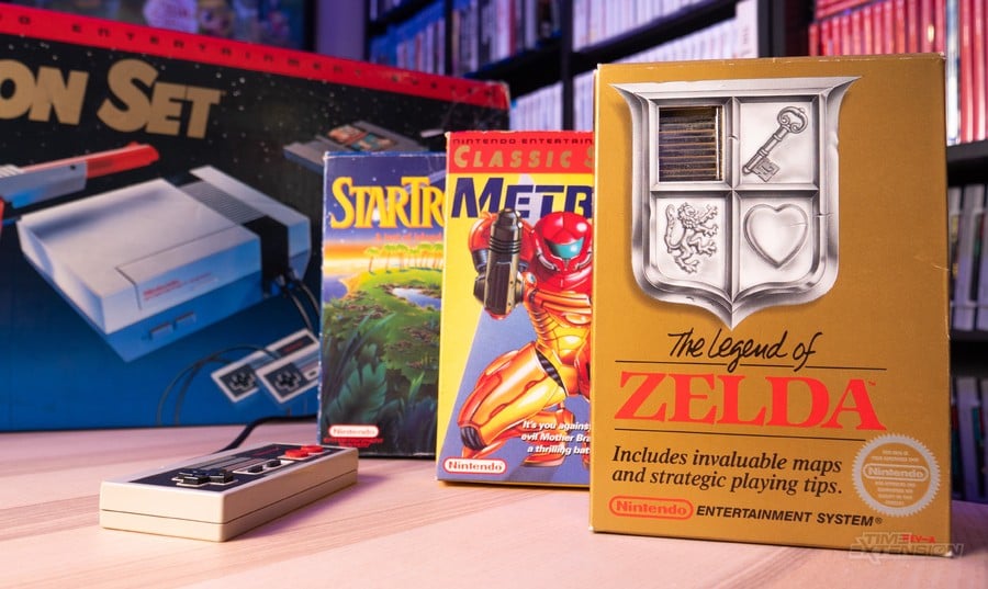
The design that he came up with for the revised NES packaging notably featured a blue & black space-like background dotted with stars, as well as a more sophisticated use of light and shadow in the product photography, and a red strip running along the top of the packaging with a custom font that read "Nintendo Entertainment System". This is a style that he would later use again across the packaging for various NES accessories, with the idea being to establish an association with the red, black, and blue colouring that would allow players to immediately spot a Nintendo product even without reading the box.
"My orientation was always 'stand-out'," said Girvin. "Because the challenge was always about the speed of recognition, and the customer’s recognition of the Nintendo line-up. To try and increase that, we built systems to identify and realize the Nintendo array in a manner that customers could always quickly see what the core of the NES was."
Speaking about the packaging for the games, meanwhile, he told us the process would typically involve travelling to the Nintendo of America HQ in Redmond, Washington, where the company's gaming experts would be working on the US renditions of the original Japanese Famicom games. He would be shown the game and be allowed to ask the testers questions, with the task then being to interpret what Japan had done, with an eye on targeting a North American customer.
"I was involved with the gameplay of all the packaged games we worked on," said Girvin. "I wanted to know how they worked, how they played, and the features we could work with as call-outs and screen captures on back panel treatments. In every instance, we supplied multiple iterations for review by NOA executives to make sure we were on the right track.
"Much of the time, the original gaming packaging was developed for Japanese customers. Our role, therefore, lay in the re-interpretation of Japan-originated games and rebuilding that content for American audiences.
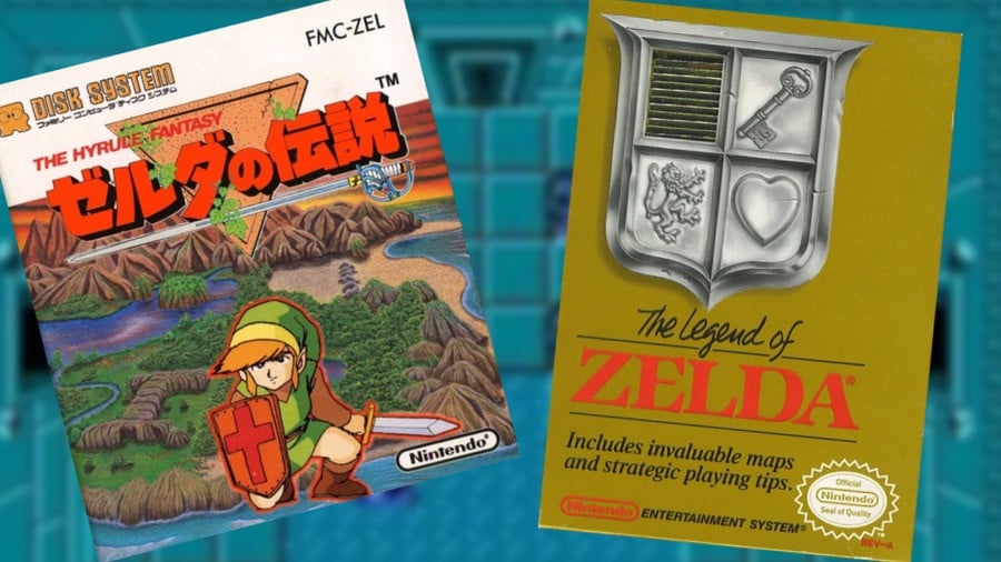
"This, of course, was often diametrically opposite. I worked both in Japan and in the US, building brands, respectively, for each market. And, when it came to Nintendo, Japan’s approach was often more character-based, but in the US, we were regularly looking for more of an iconic at-shelf presence, since back then, these games were merchandised in-store. To that end, the shelf presence was always our primary consideration."
A good example of this difference in philosophy can be seen in the artwork of the original Legend of Zelda. For the original 1986 Famicom Disk System release, Japan had favoured an anime-style illustration of Link on the box, standing against a backdrop of Hyrule, while the 1987 US release instead attempted to hook players with a gold box and a silver coat of arms featuring items from the game that enticed players to pick to find out more.
This collaboration undoubtedly ended up paying off for Nintendo, which would continue to establish itself as the leading game developer in North America. As a result, Girvin's services were retained into the late 80s and early-to-mid '90s, with the designer contributing further packaging designs for consoles such as the Nintendo Game Boy, the SNES, and the Virtual Boy, as well as games like Wario Land, Yoshi's Island, and SimCity.
For many of these games and consoles, he admits to us his relationship with them was strictly professional, with the extent of his involvement being to familiarize himself enough with the game or device to capture screenshots and come up with an exciting presentation for the final packaging. But, in the case of the Game Boy, however, he found that it also appealed to him, being something he was prone to messing around with when he found himself with some time to kill.
"Personally, I wasn’t a 'gamer,' as in actively, continuously engaged," said Girvin. "But, being involved with the Game Boy from the very beginning, and the ease of mobility, I had one that was in my backpack that I used to play Super Mario Land on."
While our conversation with Girvin was originally meant to be about the NES alone, upon discovering this fact, we understandably couldn't get away with not asking him how he came up with the Game Boy's famous North American packaging, which memorably featured a Tron-esque image of a pair of glowing hands grasping the handheld against a futuristic grid.
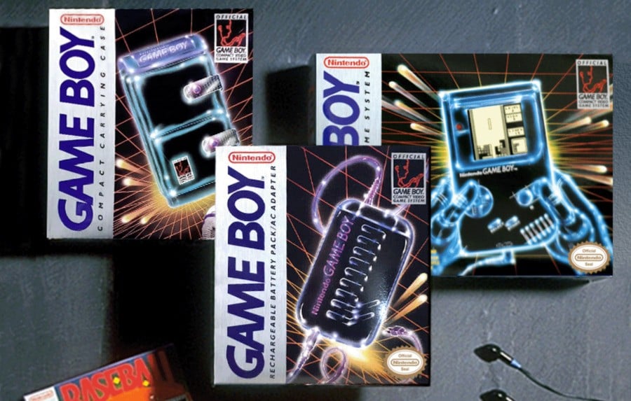
And here's what he ended up telling us about its creation: "CEO Arakawa gave me a sales goal. In two years, we had to sell a certain number of units in the American market, which we beat in one year. The number of units, I don’t recall. But it was, and is, unusual for an executive or brand manager to offer a sales expectation. That only happened in my career one other time — in the case of Kraft Macaroni and Cheese.
"As to the technological styling of the packaging — this is, and was, a high-tech piece of equipment," continued Girvin. "A handheld for gaming enthusiasts. So my illustrative approach was to express Nintendo's futurist approach. But we also boosted every part of the presentation, particularly in the name Game Boy.
"I’m rarely comfortable with out-of-the-box typography for logos. So we redrew the Game Boy logo to hold some more character. Rather than using the original Roman font we were presented with, I italicized it, redrew all the characters to give it better kerning and letter-spacing, and to impart more of an action-oriented expression."
Looking back at it now, the final design of the packaging is clearly a stunning piece of design work, and must have sent imaginations wild back when the Game Boy originally landed on store shelves back in 1989, perfectly demonstrating that this was something different, exciting, and could potentially revolutionize the way we play games.
That wasn't our only off-topic question, however, as we also wanted to hear some of his thoughts on Nintendo's current packaging for its first-party games and consoles, and what he would recommend if given the chance to work on Nintendo's product line again.
To this, he answered, "I think that the core principle that we’d developed with Nintendo was based on a bold assertion at shelf and quickly comprehensible product names and attributes. But now, less than then, the product depiction is more conventional than our earlier dynamic positions
"[My recommendation to them would be to make things] more distinct; less generic; more dynamic; and less quiet. This is just as relevant in digital portrayal as it was in shelf settings."
What do you think? Do you agree? Let us know in the comments.

