
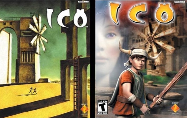
Fumito Ueda's artwork for Japan Studio's classic action-adventure Ico is constantly brought up when talking about great video game box art. The Giorgio de Chirico-inspired cover depicts the horned character Ico pulling the young girl Yorda through a surrealistic landscape, while a series of stone ruins dwarf the vanishing figures. It perfectly sets the stage for the mysterious and epic adventure about to take place, without being a literal representation of the game's story or art style.
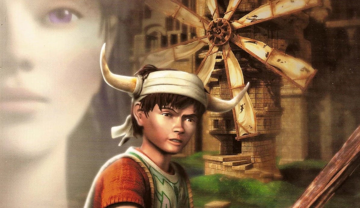
Yet, when Ico launched in North America back in September 2001, this isn't what was shipped along with the game. Instead, North American players had to make do with a more generic 3D cover that depicted Ico holding a stick below a windmill and Yorda's giant CG-rendered face looming overhead. For years, the disparity has led to negative comparisons between the two covers, with the North American art since being dubbed "one of the worst cover art downgrades" ever. The former vice-president of Sony's Japan Studio Yasuhide Kobayashi even later blamed it, in part, for the game's poor sales in the United States, making this claim at the 2009 DICE Summit Asia.
Recently, Time Extension decided to look into how this cover came about, speaking to the packaging's creative director Brian Balistreri and the artist behind it, Gregory Harsh. Both were employees at Beeline, a company primarily responsible for video game and entertainment packaging and advertising in the early 2000s, whose clients notably included Sony Computer Entertainment.
Harsh had joined the company fresh out of college, while Balistreri was already a well-established graphic designer at the time having created the art for several arcade coin-op cabinets at Atari in the early 80s before working as a freelancer for Data East and various other companies including Sony Imagesoft.
In the beginning, Beeline was known for doing a lot of 2D illustration work for video packaging, but as 3D became more prominent as a selling point, it had to quickly adapt as companies (including Sony) wanted the cover art to be a reflection of this change.
Sony specifically said for Twisted Metal, they wanted CGI art. At that time, I didn’t even know any CGI artists. They weren’t that easy to come by...
Balistreri explains, "We had done many, many, many hundreds of game packages where we had been using traditional paint and inks and other illustration techniques, and it was just in the mid-90s that companies really wanted the computer-generated look and CGI was just really coming into its own. Sony specifically said for Twisted Metal, they wanted CGI art. At that time, I didn’t even know any CGI artists. They weren’t that easy to come by, so I got this guy to work on it who had been one of the few people who seemed to have a little experience in the genre and he kept coming back with stuff that was really disappointing. He just wasn’t getting it. And so, Gregory [Harsh], he just looked at that… He had just been dabbling with Lightwave for fun and I was commiserating with him about the results I was getting from this other guy and he said, ‘You know, I can do better than that.’ And I said, ‘Go for it! Give it a shot!’"
Harsh's work on the Twisted Metal series led to him becoming one of the go-to CG illustrators at Beeline, with other games he worked on during his time at the company including Spyro the Dragon and Armored Core. As a result, when the Ico project came along he was a shoo-in to take a stab at a 3D cover.
Contrary to popular belief, when Beeline first started working on the packaging Fumito Ueda's classic illustration for the game had yet to be finalized, on account of Ico being released in North America before other regions. In fact, as both men tell us, Sony only provided Beeline with just a few screenshots of the game to work with, making it unsurprising that its version of the cover was much "safer" than what came after.
"We started with Beeline’s sketch artist [Steve Lang] doing a few pencil layouts," says Harsh, "Which I then modified in Photoshop to meet whatever changes Sony had. Then (as a budding 3D artist) I pushed Beeline to let me take a crack at it in 3D using Lightwave. I don’t recall having much information about the game."
We certainly weren’t given time for conceptual flights of fancy or to do anything experimental or avant-garde with it.
Balistreri adds, "We certainly weren’t given time for conceptual flights of fancy or to do anything experimental or avant-garde with it. As usual, we were under a time constraint and they were looking for something straightforward and we gave them something straightforward. [...] It was kind of a running joke in our group that the client would never choose the one that we thought was the best or we liked the best. So, I’m sure it wasn’t the best concept that they chose, because it almost never was."
From the initial sketches, Sony ended up picking one that prominently featured the character of Ico as its center point. This meant Harsh had to create a CG model of the character, something that proved more difficult than expected, thanks to the often contradictory feedback that the company was receiving from Sony.
"We must have gone back and forth with Sony — I don’t know — five or six times," says Balistreri. "Just fine-tuning his expression. We’d get to where the kid looked like he had just the right expression on his face and they’d come back and say, ‘He looks committed but not determined’, or they’d put these real, fine points on it like ‘Now, he looks strong, but not vulnerable enough.’ They’d contradict themselves sometimes and we really had a balancing act, like walking a tightrope, of trying to get the expression they wanted with all of these subtle emotions conveyed. Which is, you know, it’s always been a challenge in 3D art. Certainly in the early days, much more so."
They’d put these real, fine points on it like ‘Now, he looks strong, but notvulnerable enough.’ They’d contradict themselves sometimes and we really had a balancing act...
Hearing both men's stories today, it makes sense why the cover didn't exactly turn out to be a masterpiece, with the company on a tight deadline and not really in a position to take risks due to his lack of knowledge about the property. For a more generic game, the movie-esque poster probably would have slipped under the radar. However, when judged against the contents of the game itself and the artwork that followed, it's hard to ignore the odd juxtaposition. Nevertheless, neither person seems that scathed by the criticism and have both gone on to have long and successful careers in the film and video game industry.
"It was just a matter of timing," states Harsh. "I only became aware of the controversy when my package appeared on a "worst package fronts" list a few years ago. It's a badge of honor [now, and] I find the backlash against the cover amusing. I don’t claim it’s a great piece of art! And I too prefer the Japanese art - but the US was about a big logo and had a thing about big heads in the background (maybe because of movie posters?)."
"I know ICO has sort of a cult following now," says Balistreri. "That would be putting it mildly, right? So, yeah, I guess, it doesn’t surprise me that people would go back and dissect things like this all these years later, but it’s kind of funny to me more than anything."
Since working on the Ico cover, Harsh later worked on the manuals for several LucasArts games including Star Wars: Knights of the Old Republic and Indiana Jones and the Emperor's Tomb, before joining the company in-house in 2004. He's now an art director at Electronic Arts. Balistreri, meanwhile, works at Paramount as a senior designer after 40 years designing video game packaging.