
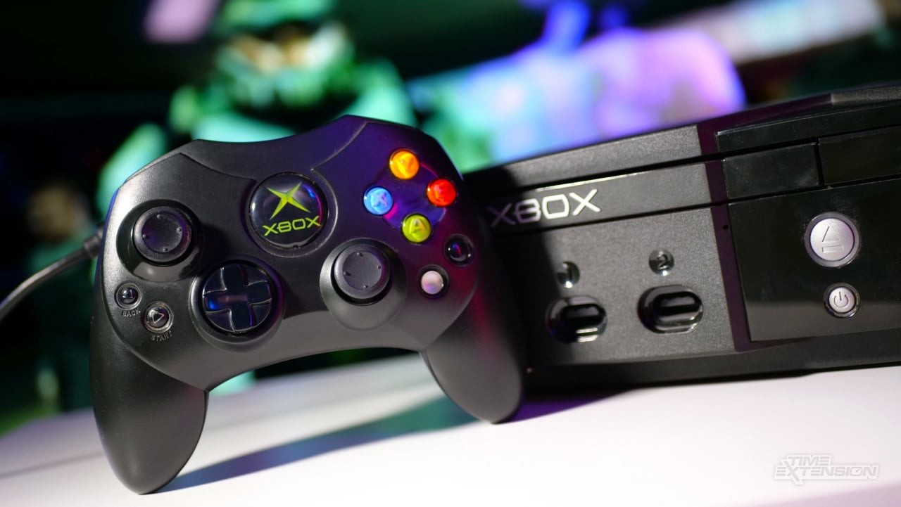
The Xbox brand is one of the most recognizable in modern gaming, having established itself over the course of several console generations starting way back with the release of the original Xbox in 2001. However, as its co-creator Seamus Blackley told Time Extension earlier this year in an exclusive interview, the brand didn't have the most glamorous of origin stories, with the name and logo coming about thanks to the failure of Microsoft and an external design firm to come up with anything better.
Speaking to Time Extension, Blackley told us, "The Xbox logo is all tied up with the name of the platform, which came from the fact that we were pitching it internally as a hardware spec that was optimized for DirectX. So we were going to make a box, which is what people call a machine or a system. A box for DirectX. So it was the DirectX box. And eventually, we called it Xbox assuming there would be a better name coming along at some point."
As Blackley told us, it was the job of Microsoft's marketing department to come up with a catchier name to replace what they already had, but the company's suggestions "were absolute garbage". So the name stuck around as they continued to develop the console. As for the classic 'Xbox Green', that also came about purely by chance.
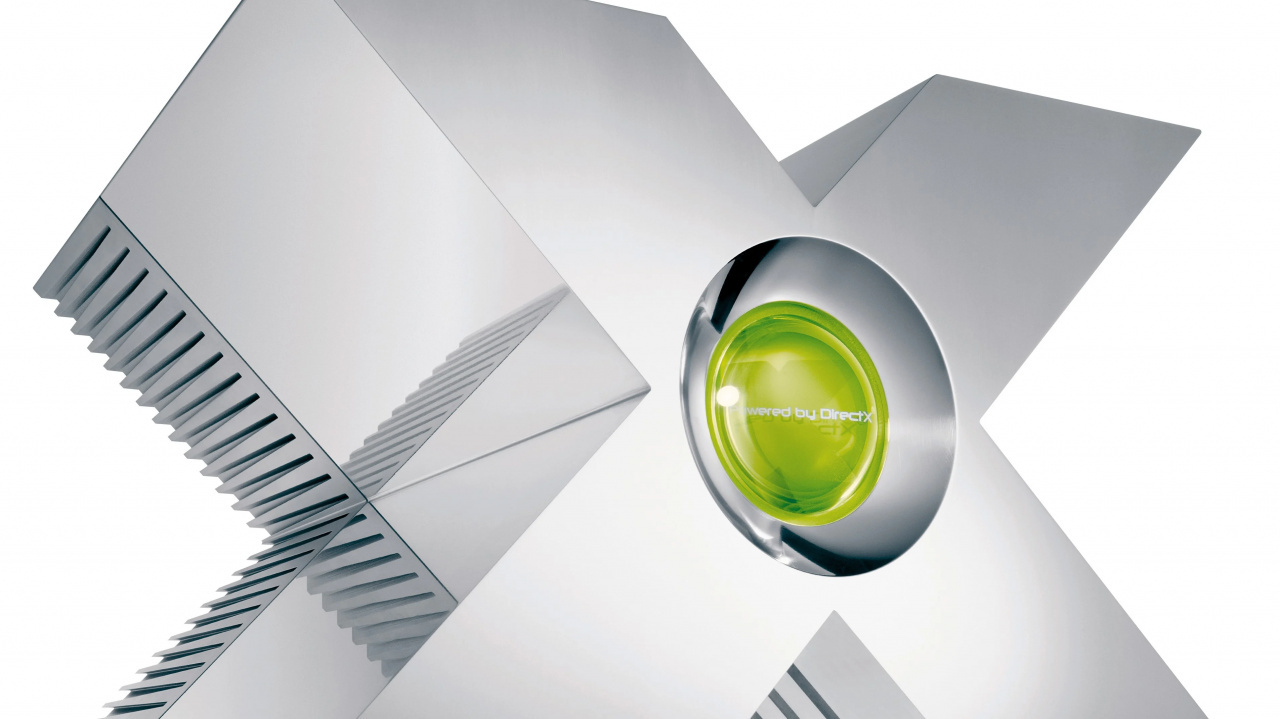
Blackley recalled, "So we had done a lot of renderings and made a logo based on the DirectX ‘X’, which we put on those big silver X’s that we made as a sort of show car. Those were made literally by me and three people. One of them was this guy Horace [Luke] and he had got a new set of markers that had a brush tip. They were absolutely brand new and he had a bunch on his desk at the design department of Microsoft where they were doing hardware design for the mouse and the keyboard. Everyone had stolen all the colours and all that was left were greens basically and some blues. We couldn’t have blue because the PlayStation was blue, so we started drawing in Green and it kind of stuck. So we had this name Xbox and the colour green."
Before the Xbox was released, Microsoft did have one last go at replacing the name, hiring a professional design company to come in and suggest something else. But as Blackley told us, the ideas they came up with weren't much better.
He explained, "These branding companies came in and gave these absolutely appalling, just fucking appalling treatments. None of the names were any good."
If you're wondering, 'How bad could they be?' Well, you can judge for yourself, as Blackley previously revealed a long list of the rejected suggestions in an interview with Edge Magazine back in 2013. These included:
- MAX (Microsoft Action Experience)
- AIO (All In One)
- MIND (Microsoft Interactive Network Device)
- FACE (Full Action Center)
- MITH (Microsoft Interactive Theatre)
- XON (Experience Optimised Network)
- MVPC (Microsoft Virtual Play Center)
- TAC (Total Action Center – discs/games could be called TACs)
- MARC (Microsoft Action Reality Center)
- LEX (Live Entertainment Experience)
- M-PAC (Microsoft Play and Action Center)
- RPM (Real Performance Machine)
- MOX (Microsoft Optimal Experience)
- E2 (Extreme Experience)
- MTG (Microsoft Total Gaming)
- VIP (Virtual Interactive Player)
- PTP or P2P (Powered To Play)
- VIC (Virtual Interactive Center – disks/games could be called VICs)
- MARZ (Microsoft Active Reality Zone)
- TSO (Three, Six, Zero)
- EHQ (Entertainment Headquarters)
- O2 (Optimal Ozone or Optical Odyssey)
- MIC (Microsoft Interactive Center)
- R&R (Reality and Revolution)
- MEA (Microsoft Entertainment Activator)
- AMP (Active Microsoft Player)
- VPS (Virtual Play System)
- MAP (Microsoft Action Play)
- MEGA (Microsoft Entertainment & Gaming Attendant or Microsoft Entertainment & Gaming Assembly)
- CPG (CyberPlayGround)
- VERV (Virtual Entertainment & Reality Venture)
- OM (Odyssey of the Mind)
- P2 (PowerPlay)
- IS1 (Interactive System In One)
- MET (Microsoft Entertainment Technology or Microsoft Entertainment Theatre)
In addition to pitching names, the design firm submitted a logo design as well, with the concept simply being a spruced-up version of Luke's logo that turned the tips of the X into points and made the X fit inside a circle.
[Microsoft] spent hundreds of thousands of dollars and we all looked at this like, ‘Are you fucking kidding me?’ Like we should get our money back. These are terrible names and they’ve just used basically the logo we’ve pulled out our ass.
Blackley remembered, "[Microsoft] spent hundreds of thousands of dollars and we all looked at this like, ‘Are you fucking kidding me?’ Like we should get our money back. These are terrible names and they’ve just used basically the logo we’ve pulled out our ass.'"
There was also another problem Blackley spotted too. As Blackley recalled, the revised logo looked remarkably similar to another existing logo — one the team was used to seeing pretty much every time they travelled to the UK. However, this didn't prove to be much of an issue in the long run.
He told Time Extension, "If you get off the plane at Heathrow — and this still may be true — you see advertisements for the Heathrow Express. We were always in the UK, so we told them, ‘This is just the Heathrow Express logo in green. What the fuck are you even doing?’ So that’s how it came about. We approved it and then some internal artists touched it with us yelling at them and that was it."
As we said before, it's not exactly the most glamorous of origin stories but it is pretty funny to look back on now the brand has established itself as one of the most important in the gaming space. Personally speaking, we couldn't imagine the Xbox brand and logo looking any other way. But if someone was willing to throw a few hundred thousand our way, we'd certainly take a swing at it.